The yield curve and 18 indicators that actually move markets
Live yields plus growth, inflation, labor, and policy data, updated as the Fed and BLS release it.
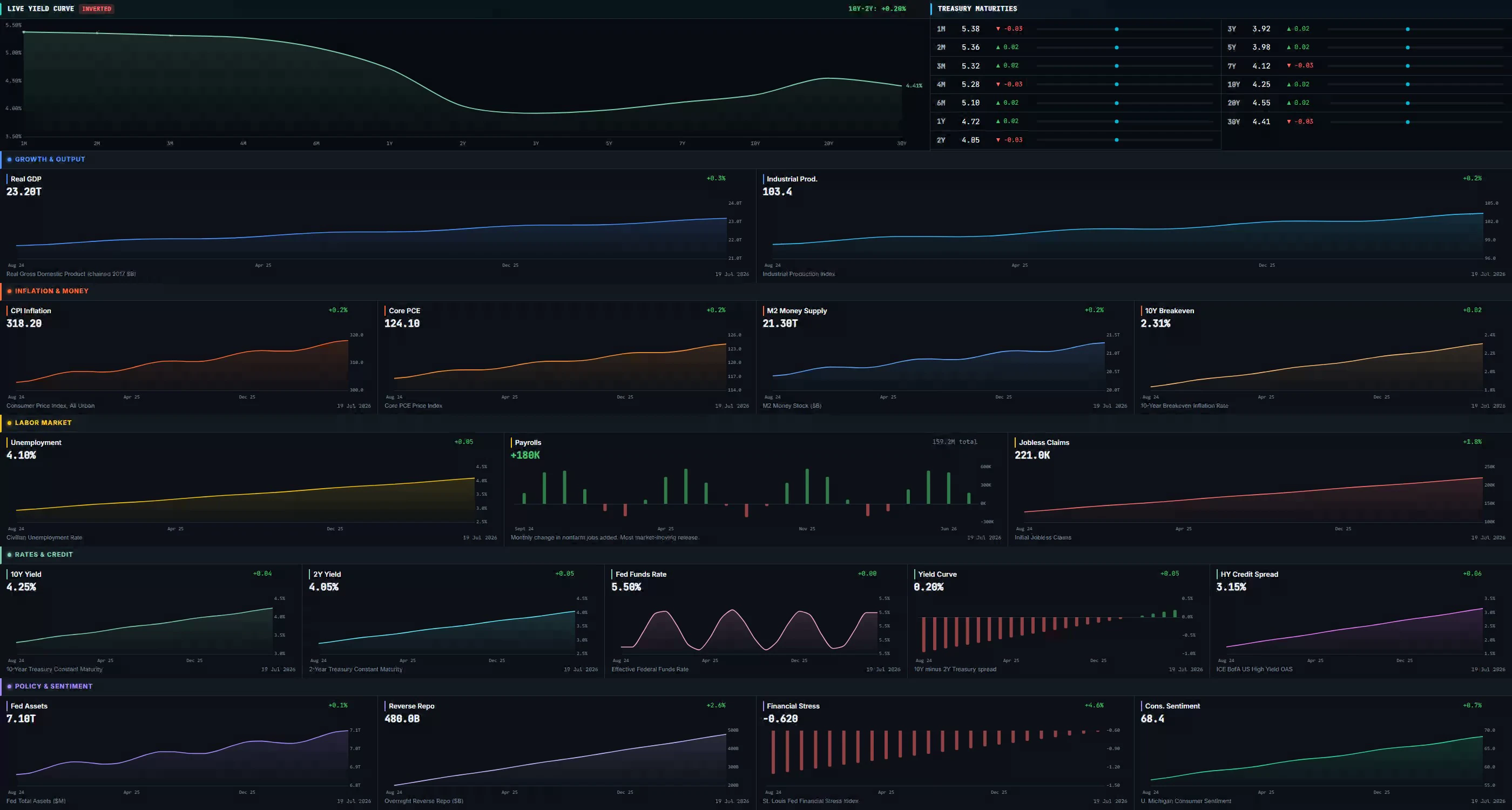 Real terminal UI · illustrative sample data
What is the Macro tab?
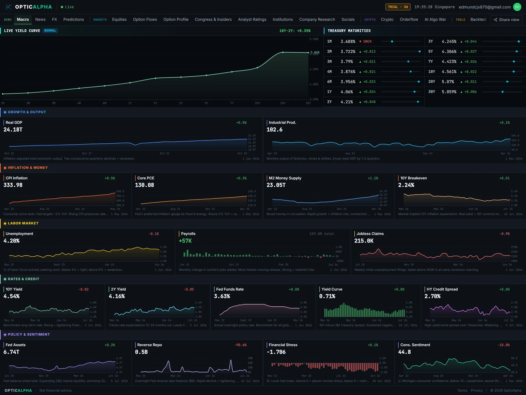
The Macro tab opens with a live yield curve. It plots the US 2-year, US 3-month, and US 10-year Treasury yields alongside the UK 10-year and German 10-year, sourced from CNBC's quote API and refreshed roughly every 60 seconds. When the 2-year yield trades above the 10-year, the chart flags it: that inversion is one of the most closely watched recession signals in the bond market, and it has preceded most US downturns of the past several decades.
Below the curve sit 18 indicators pulled from FRED, the St. Louis Fed's economic database, grouped into five categories: Growth, Inflation, Labor, Rates, and Policy. Each one shows as a sparkline with the current reading, the prior reading, and which way it moved, so you can see the trend without reading a raw number out of context.
FRED updates at whatever pace the source releases each series, monthly for most of them and weekly for a few, like jobless claims. That's a different rhythm from the yield curve above it, which moves close to real time. The two panels answer different questions: the curve shows what bond markets are pricing right now, the indicators show the underlying data behind it.
What OpticAlpha shows
Live yield curve
US 2-year, 3-month, and 10-year yields plotted against the UK and German 10-year, refreshed about once a minute. An inversion gets flagged the moment the 2-year crosses above the 10-year.
18 FRED indicators
Every series from the St. Louis Fed grouped into five categories: Growth, Inflation, Labor, Rates, and Policy. Each shows a sparkline with the current and prior reading.
Growth & inflation
Real GDP, Industrial Production, and Retail Sales alongside CPI, Core CPI, PCE, and Core PCE, the measure the Fed actually targets when it sets policy.
Rates & policy
Fed Funds Rate, 10-Year and 2-Year Treasury yields, and Real Yield (TIPS), shown next to M2 Money Supply and Federal Debt.
The macro tab, in the terminal
How traders use this
Curve shape is the first thing to check before reading anything else on the page. An inverted curve, where short yields sit above long ones, has historically shown up late in the economic cycle, ahead of a slowdown or recession. A steep curve, where long yields run well above short ones, tends to show up early in an expansion, when growth and inflation expectations are both rising. Where the curve sits between those two shapes is a rough read on where the cycle currently stands.
Among the 18 indicators, Core PCE gets more weight than headline CPI for a specific reason: it's the inflation measure the Federal Reserve actually targets when it sets policy, since it strips out food and energy and captures how spending shifts as prices change. The 2-year yield is worth watching separately from the 10-year too. It tracks near-term expectations for where the Fed will set rates far more closely than the 10-year does, which reacts more to long-run growth and inflation assumptions.
M2 money supply is easy to skip past, but its trend has mattered more than its level. Sustained contractions in M2 have historically shown up before equity market corrections, since less money circulating tends to mean tighter financial conditions working their way through the system with a lag. It won't tell you when a pullback happens, but a shrinking M2 alongside an already-inverted curve is a combination worth taking seriously.
Terms on this page
- Yield curve inversion
- When a shorter-maturity bond yields more than a longer-maturity one, commonly read as a recession warning.
- Core PCE
- Personal Consumption Expenditures price index excluding food and energy. The Fed's preferred inflation measure.
- FRED
- The Federal Reserve Bank of St. Louis's economic data database, the source for most of OpticAlpha's macro series.
- M2 money supply
- A broad measure of money in the economy, including cash, checking deposits, and easily convertible near-money. Contractions have historically preceded equity market stress.
- Real yield
- A bond yield adjusted for expected inflation, derived from Treasury Inflation-Protected Securities (TIPS).
Questions traders ask
Where do the yield curve prices come from?
Live bid and ask prices from CNBC’s quote system for US 2Y, US 3M, US 10Y, UK 10Y, and German 10Y, refreshed roughly every 60 seconds.
What does a yield curve inversion mean?
It means a shorter-dated yield, usually the 2-year, trades above a longer-dated one like the 10-year. Historically this has preceded most US recessions, though the lead time varies widely.
Which 18 indicators does the macro tab track?
Growth (GDP, industrial production, retail sales, housing starts), inflation (CPI, core CPI, PCE, core PCE), labor (unemployment, payrolls, jobless claims, participation rate), rates (fed funds, 10Y and 2Y treasury, real yield), and policy (M2 money supply, federal debt).
How often does FRED data update?
At whatever cadence the source releases it, monthly for most series and weekly for a few like jobless claims. OpticAlpha polls FRED every 6 hours so a new release shows up quickly without hammering the API.
Why is core PCE highlighted over headline CPI?
Core PCE strips out food and energy and is the Fed's own preferred inflation gauge for policy decisions, which makes it more relevant to rate-path expectations than the more widely quoted CPI number.
Related reading
See the live yield curve
14-day free trial. No credit card required.
20+ live channels · $10.50/mo billed annually