The whole market, top to bottom, in one glance
Index prices and VIX, sector rotation, breadth, and the narrative behind it, in one tab.
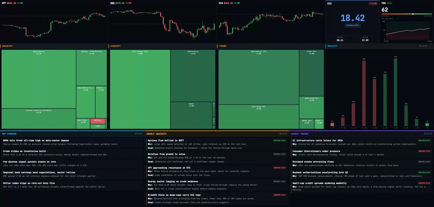 Real terminal UI · illustrative sample data
What is the Overview tab?
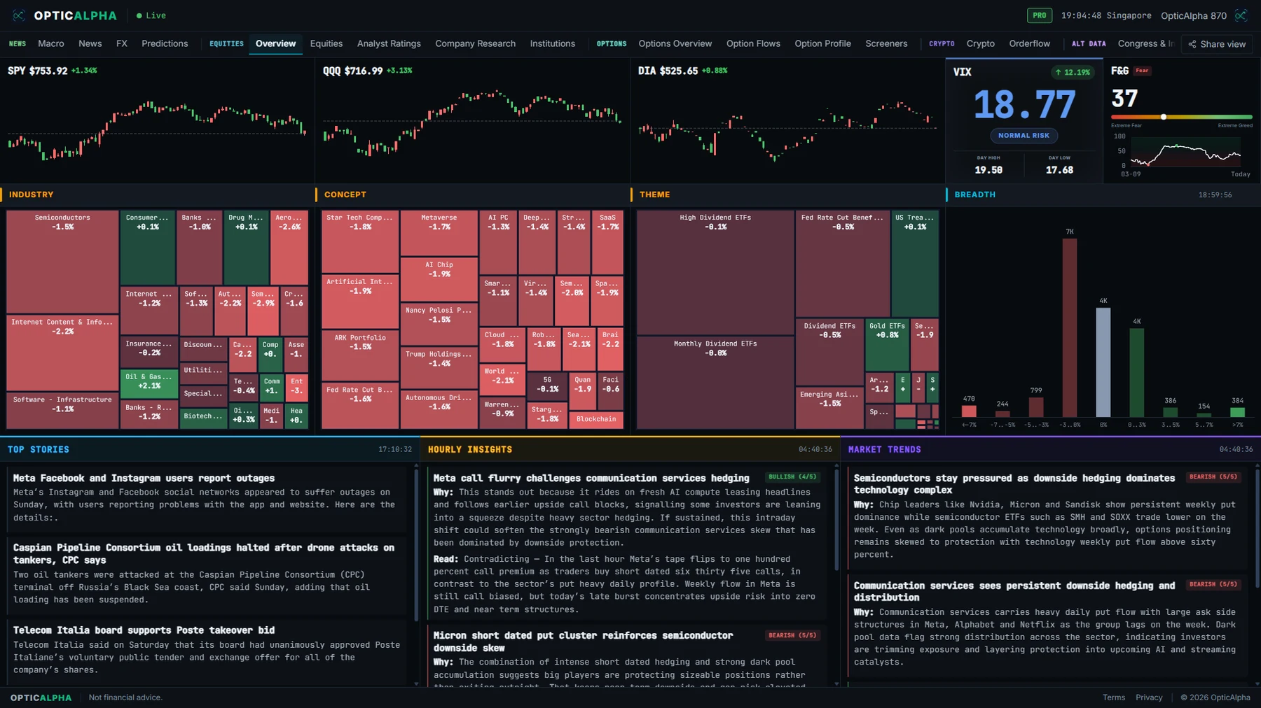
Overview is the 30,000-foot read on the market, built to answer one question fast: what is the tape actually doing right now, and why? SPY, QQQ, and DIA stream live as one-minute candles alongside VIX and a Fear and Greed gauge, so price and the mood behind it sit side by side.
Below the hero strip, three sector heat maps slice the same rotation data three different ways: Industry for the traditional classification, Concept for thematic groupings like AI infrastructure, and Theme for narrower baskets like semiconductor ETFs. A breadth histogram sits next to them, bucketing how many stocks are up big, down big, or flat, so a flat index with weak breadth reads as the different, weaker market it actually is.
Three narrative columns close out the tab: Top Stories, Hourly Insights, and Market Trends, each a scheduled AI-written summary tagged bullish, bearish, or neutral with a plain "why" behind the call. It's a broadcast, not a chat: you read it, you don't prompt it.
What OpticAlpha shows
Live index strip
SPY, QQQ, and DIA candles stream in live, a minute at a time, with VIX and a Fear and Greed gauge alongside them.
Three sector heat maps
Industry, Concept, and Theme slice the same rotation data three ways, each sized and colored by today's move.
Breadth histogram
How many stocks are up big, down big, or flat, bucketed by size, not reduced to one average.
AI market narrative
Top Stories, Hourly Insights, and Market Trends, each a scheduled, directionally tagged summary of what's actually driving the tape.
The full tab, as it actually looks
How traders use this
This is the tab most traders open first, before anything single-name. Index prices and VIX set the baseline: is the tape calm or already stretched. The heat maps come next, since sector rotation often shows up well before it reads in the index itself, a quiet SPY can hide a real fight between semiconductors ripping and energy fading underneath it.
Breadth is the check that keeps a headline number honest. An index up half a percent on broad participation is a healthy tape. The same half a percent carried by three mega-cap names while the rest of the market sits flat or red is a narrower, weaker move, and the histogram is what tells them apart at a glance.
The narrative columns exist so you don't have to piece the story together from six separate numbers yourself. A bullish Hourly Insight citing options flow into a name that's also leading the heat map isn't a coincidence worth ignoring, it's the same signal showing up twice.
Terms on this page
- Sector heat map / treemap
- A grid of sector or theme boxes sized and colored by today's move, so rotation across the market reads as a color shift rather than a single number.
- Market breadth
- How many stocks are participating in a move, bucketed by size of gain or loss, as opposed to a handful of large names carrying the index.
- VIX
- The CBOE Volatility Index, a measure of expected S&P 500 volatility over the next 30 days. Above 20 is generally considered elevated.
- Fear and Greed Index
- A composite sentiment score from 0 (extreme fear) to 100 (extreme greed), used as a contrarian gauge by some traders.
- Concept / theme plate
- A thematic grouping of stocks (for example AI infrastructure, or semiconductor ETFs) that cuts across traditional sector lines, used alongside industry classification to show rotation a sector-only view would miss.
Questions traders ask
What does the Overview tab show that other tabs do not?
It's the 30,000-foot view: index prices and volatility, which sectors are rotating in or out, how many stocks are actually participating in the move, and a narrative summary tying it together. Equities, by contrast, is built for single-name actionable lists like movers and Hot List.
What do the three sector heat maps show?
The same underlying sector data sliced three different ways: Industry (traditional sector classification), Concept (thematic groupings like AI infrastructure or EV supply chain), and Theme (narrower baskets like semiconductor ETFs). Each treemap sizes and colors sectors by today's move, so rotation shows up as a shift in color across the grid, not just a single index number moving.
What is the breadth histogram measuring?
How many stocks are up big, down big, or flat, bucketed into ranges rather than reduced to one average. A market where the index is flat but breadth is heavily skewed toward decliners is a different, weaker market than the headline number alone suggests.
Are Top Stories, Hourly Insights, and Market Trends AI-generated?
Yes. Each is a scheduled, one-way narrative summary written from the same live data the rest of the tab reads, tagged with a directional read (bullish, bearish, or neutral) and a confidence-style score. They post on their own interval and don't take questions, so read them as a standing brief, not a chat.
How is this different from the Macro tab?
Macro tracks the yield curve and 18 FRED indicators, the slower-moving economic backdrop. Overview tracks what equities are actually doing right now, prices, sector rotation, breadth, and same-session narrative, the faster-moving picture on top of that backdrop.
Related reading
See the whole market at a glance
14-day free trial. No credit card required.
20+ live channels · $10.50/mo billed annually